


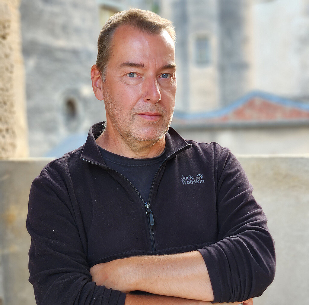
Our Ambassador Dirk Schmitt
Dirk Schmitt is a realist. Already during his painting studies at the Cologne School of Art from the mid-1980s he recognised that "isms" in art history come and go, but realism remains constant over the centuries.
Inspired by his professor's teachings, he began to explore the techniques of the old masters of painting at an early age and found his own interpretation of a classical painting style in the contemporary art scene.
Since the early 1990s the master student has been an integral part of the German art scene and with his entry into the Künstlersonderbund/Berlin (the Realists' Association of Germany), became an important representative of European realism.
For over 30 years Dirk Schmitt has exhibits in galleries, art associations, museums and art fairs, imparting workshops on classical techniques in oil painting, as well as traditional techniques such as watercolour and gouache using products from Schmincke.
His works can be found in public and private collections.
We asked Dirk about his favourite resin-oil colours MUSSINI
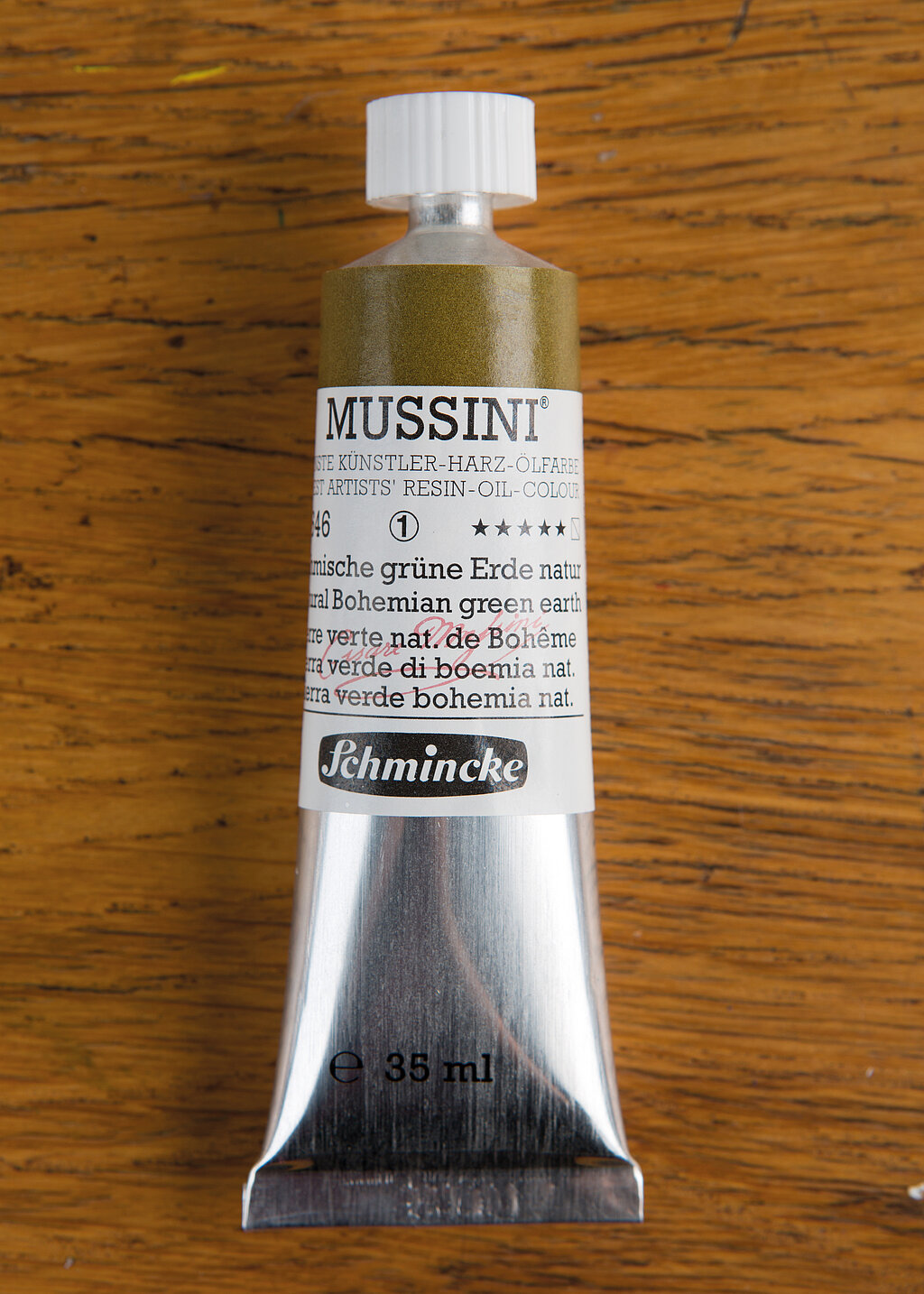
Bohemian Green Earth natural (10646)
"I like to use this shade of green, which tends towards brownish, as an imprint (full-surface underpainting) for my paintings. It influences the effect of the subsequently applied colours. I also like to use the green earth for preliminary sketching. This semi-blending colour is also perfect for underpainting portraits. Why? The skin tones used later appear less intense and are softened in a complementary way so that the skin appears much more natural."
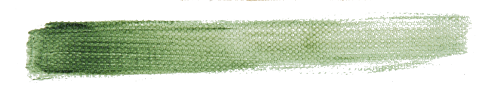
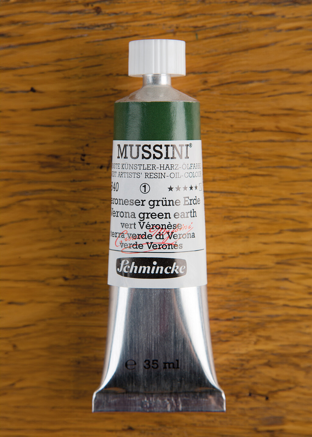
Veronese Green Earth (10640)
"This cool, earthy green colour is no longer available in its original form. Fortunately, the MUSSINI tone is very close to the original. Veronese Green Earth is a classic colour for landscape paintings. In terms of colour, it is ideal for mid-grounds in landscape paintings and at the same time perfect for mixing both warmer and cooler green tones: I achieve warm tones with light ochre or Indian yellow, and the colour tone is changed to cool when mixed with glazed blue tones. In glazes, it can be wonderfully tinted with Vandyck brown or neutral black to create natural-looking shadow areas in the landscape. The colouristics and high glazing properties make this shade indispensable for me."
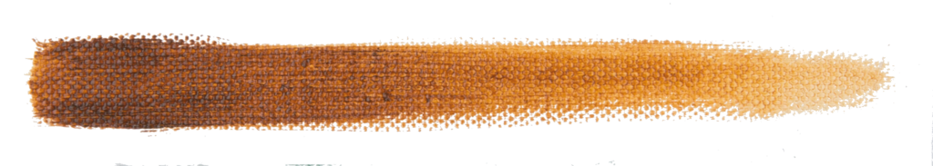
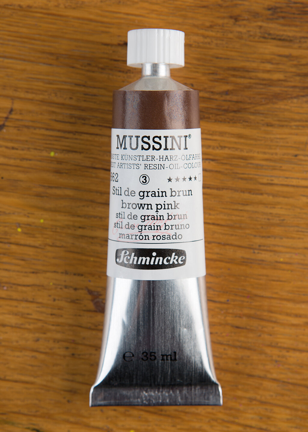
Stil de Grain Brun (10662)
"This colour has an incredible coloristic range even when used in its pure form. Applied densely, it is a strong, warm, dark brown tone (similar to Burnt Umber), but in a glaze, it almost turns towards yellow similar to yellow ochre. This makes the tone ideal for gradients both towards the dark direction, i.e. from red through dark brown to black, and for transitions into warm, light tones, i.e., in Raw Sienna or ochre-coloured areas."
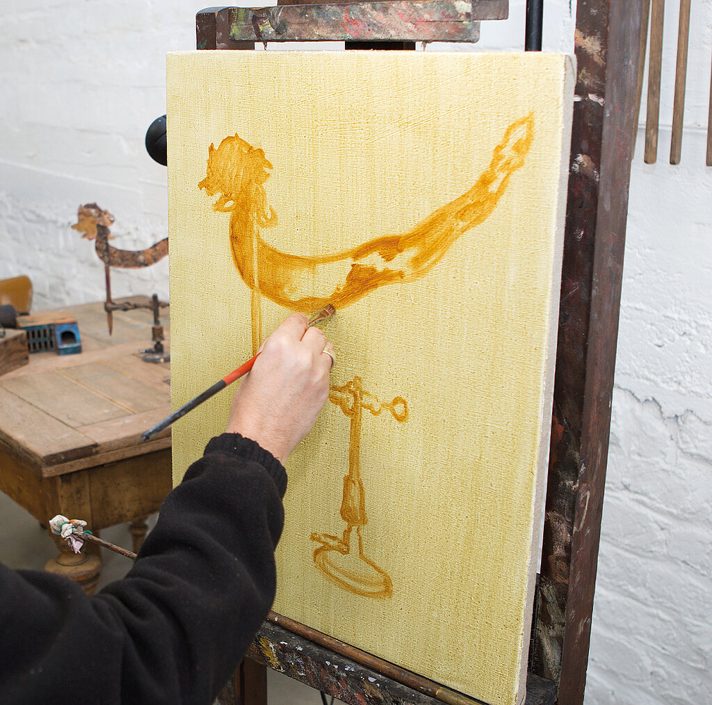
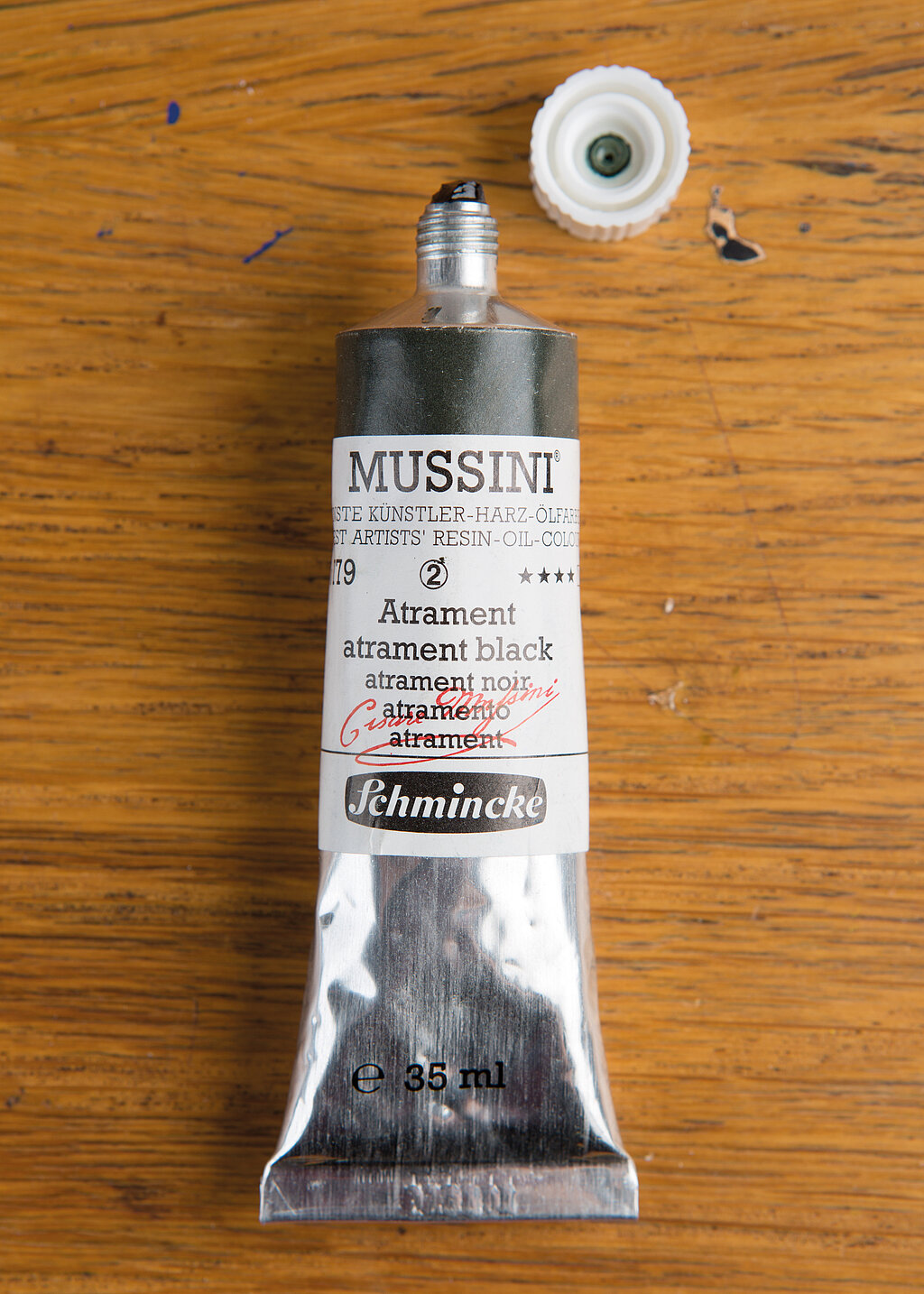
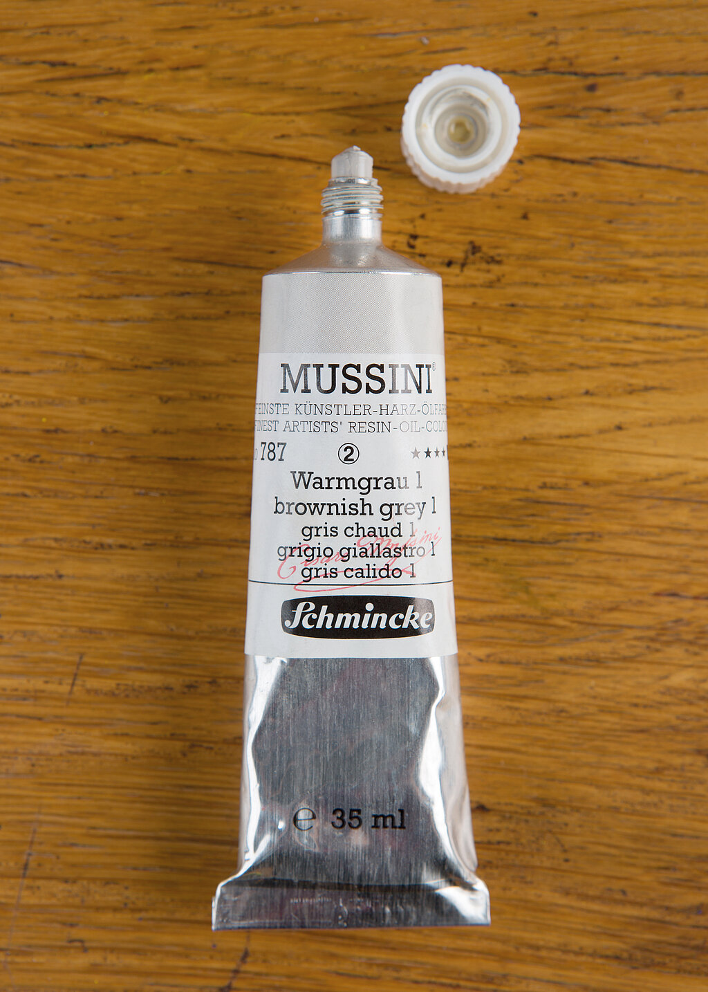
Atrament (10779) and Warm Grey 1 (10787)
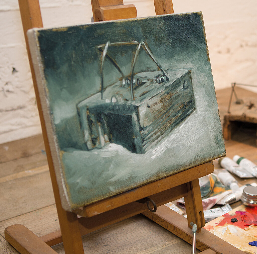
"This semi-transparent, relatively cool, greenish grey is indispensable in landscape painting, as it is perfect for dark and shadowy areas. Atrament has another special property: when mixed with MUSSINI Warm Grey 1 (an opaque, light grey), Atrament not only becomes more opaque but also brighter, making it a perfect colour for a 'Grisaille' painting (see lower photo), where a painting is created only in different shades of grey. This is known as 'tonal composition’ originally used efficiently in altar paintings. Later, such 'Grisaille' can be additionally coloured with glazes, with the tonal composition in light and dark levels remaining significant."
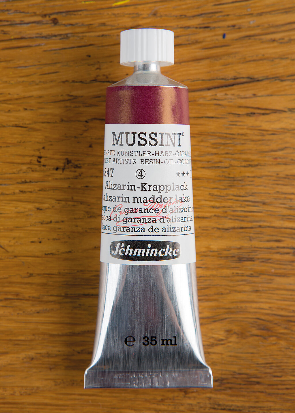
Alizarin Madder Lake (10347)
"This MUSSINI colour, artificially produced since the late 19th century is the only one that matches the dark red original colour of the past. It is distinguished by its incredible intensity and brilliance and has excellent glazing properties. Used alone, it radiates in a rich dark red, and when mixed with Indian Yellow, wonderfully warm, translucent orange tones are created. If you combine alizarin madder lake with phthalo green (the two colours are almost complementary to each other), you can also mix an achromatic neutral black with a little practice, which can then be used to tint colourful shades."
Your enthusiasm for Schmincke
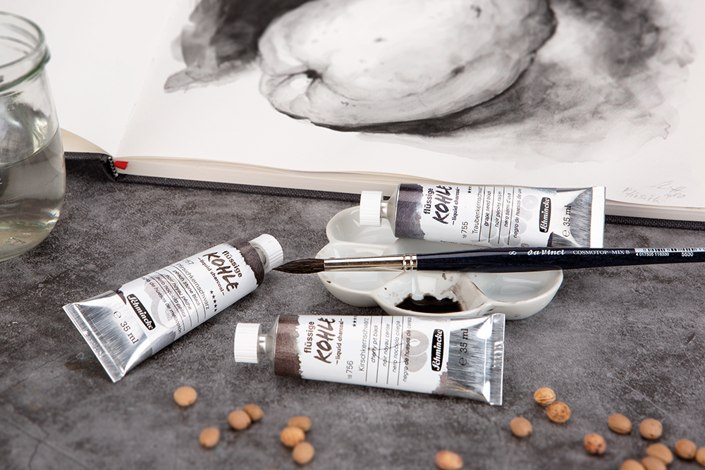
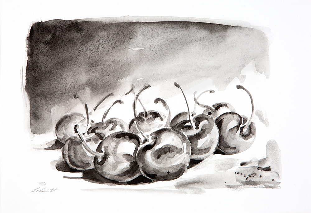
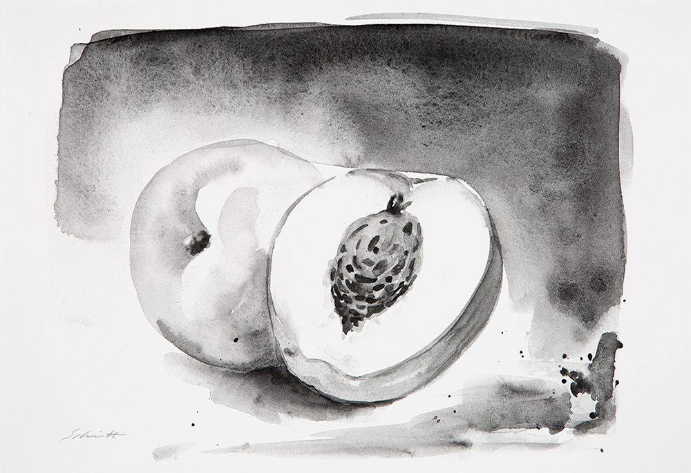
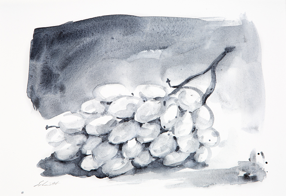
Dirk Schmitt paints with liquid charcoal
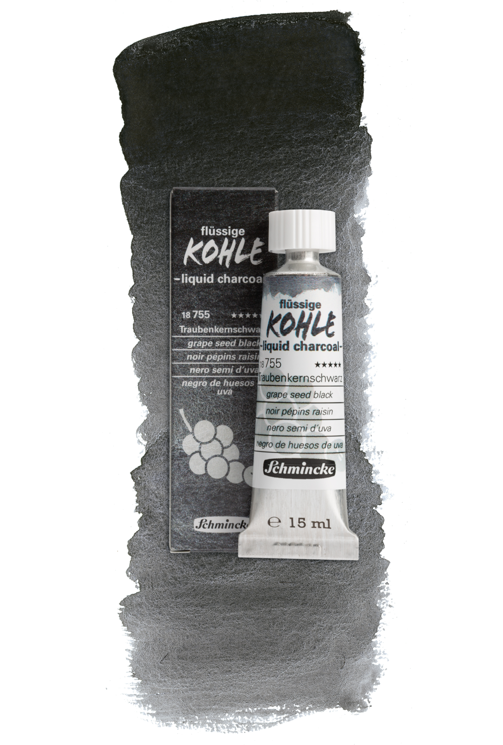
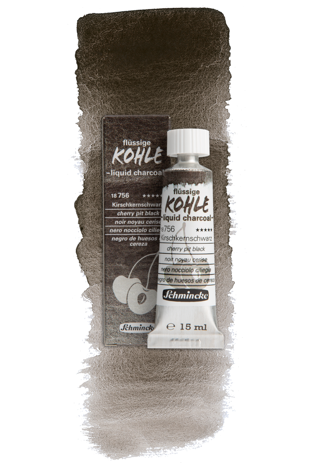
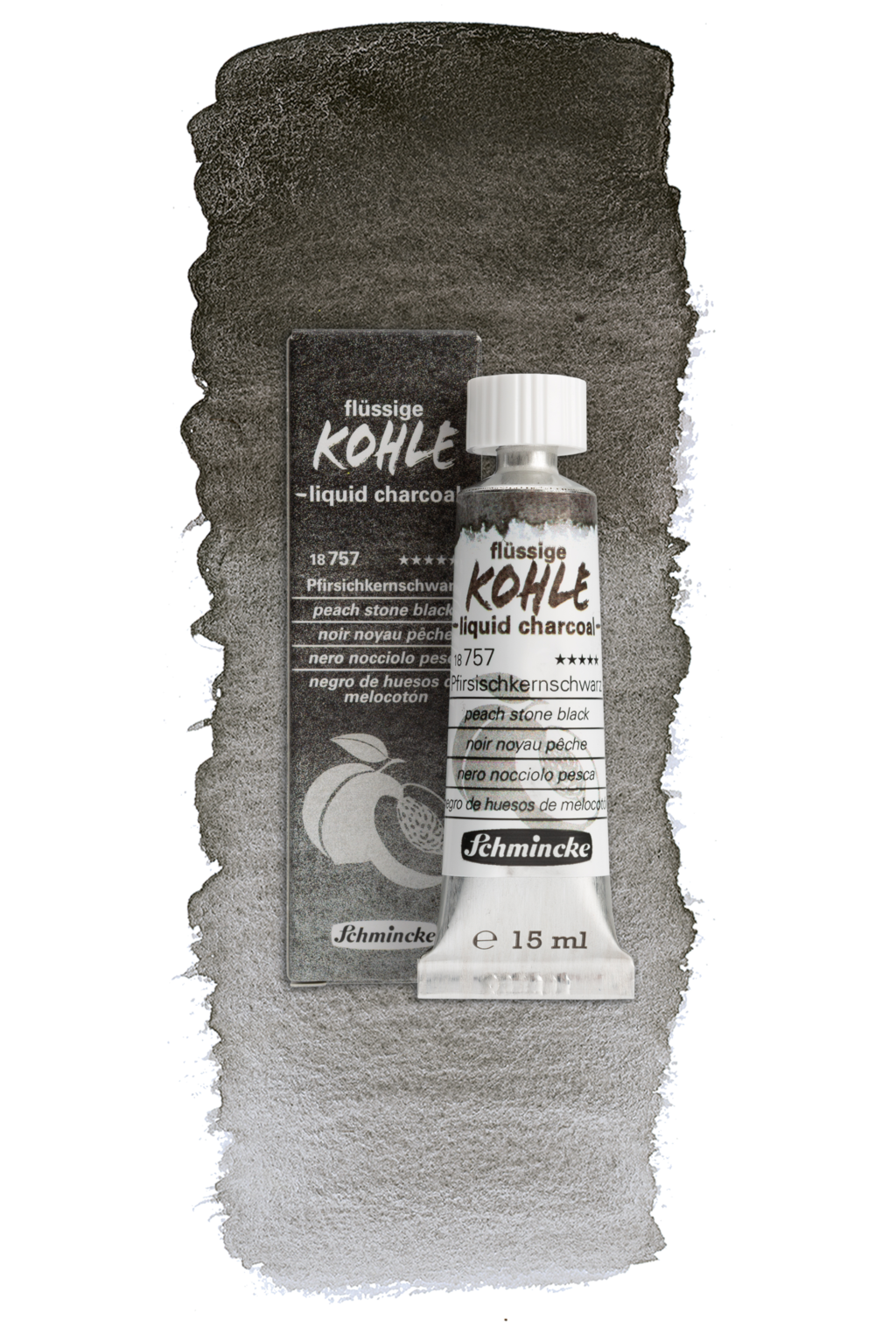
Three shades of black for the transition from drawing to painting
Liquid charcoal offers a clean, dust-free way of painting, charcoal drawing and underpainting.
Due to the large quantity of colour that is quickly available, liquid charcoal can be used to quickly work on large areas in particular. The liquid charcoal contains the same high-quality binding agent gum arabic as traditional artists' watercolours (gouache, watercolours, etc.), has a gouache-like consistency and can be diluted with water so that different nuances, textures and layer thicknesses can be achieved by applying different amounts. Depending on the surface and layer thickness, it can be smudged by hand and removed with water.
Used as a thin underpainting (e.g. in oil painting), subsequent colours do not stain or stain less than with conventional charcoal underpainting due to the greater substrate adhesion of the bound charcoal pigments. Liquid charcoal can of course be combined with charcoal for drawing.
The smudgeability and removability of the liquid charcoal depends on the surface quality of the substrate - the smoother and firmer the surface, the easier it is to change. Preliminary tests are recommended.
All three shades are available in useful 15 ml tubes and as 3 x 5 ml set in specialised stores.
Here are three pigments that always work:
The three pigments used are of natural origin (PBk 8, carbon black). They are produced by charring fruit pits from the EU area and result in three unique charcoal shades: a neutral peach stone black - 18 757, a warm, brownish cherry pit black - 18 756, and a cool, bluish grape seed black - 18 755.


More about Dirk Schmitt
Videos with Dirk Schmitt
