How to mix lighter skin tones with AERO COLOR® Professional - by Sebastian Kaufhold
Portraits have been a popular painting motif for centuries. Skin tones are known to be very diverse and in portrait painting they range from hyper-realistic images to abstract colour schemes. In addition to individual nuances, external factors such as the seasons or genetic characteristics can also influence the skin tone. Therefore, we are only describing some examples here of how different European skin types can be represented, although we are well aware that this is only part of the whole spectrum. With the help of our additional tips, we recommend experimenting and mixing many more nuances of individual skin colours.
The artist Sebastian Kaufhold has summarised his approach as follows:
Combine opaque and transparent colours:
A common colour in Europe is a neutral pastel brown or beige tone that is neither too warm nor too cool.
The undertone of European skin can be neutral, pink or slightly yellowish. People with a pink undertone often have bright, rosy cheeks, while people with a yellowish undertone have a warmer colour. These undertones give the skin a certain vibrancy and individuality.
Pastel brown tones, which are generally lighter and more muted, can be achieved by mixing in white. This gives the skin a soft and natural look. When painting a portrait, it therefore makes sense to use a combination of opaque and transparent colours. This allows the different nuances of the skin to be realistically depicted and gives the portrait a lively and natural look.
Mixing shades of brown by yourself:
Brown tones are mixed in unequal parts from the complementary colours, e.g. orange and blue. To reduce the intensity of an orange tone and shift it towards brown, add a little blue. This breaks up the colour tone and creates a natural brown tone. If you increase the red or yellow content of the orange, you will obtain a more reddish or yellowish brown tone. Alternatively, existing brown tones from the Schmincke range can of course also be adapted accordingly.
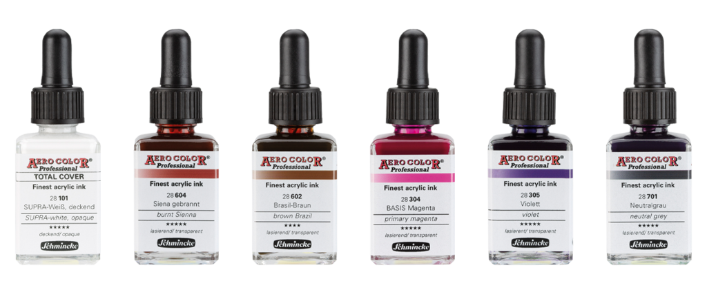
My Schmincke AERO COLOR Professional colour palette for painting portraits or mixing skin tones:
I skip the basic mixing of brown tones and use the colours burnt Sienna (28604) and brown Brazil (28602) as a base for mixing the skin tones.
As burnt Sienna is a reddish brown tone and brown Brazil is a yellowish brown tone, these two colours are perfect for the base of skin tones. By adding primary magenta (28304) and violet (28305), I achieve further nuances of warmer or colder colour tones. By adding neutral grey (28701), I achieve deeper shadow tones.
Opaque and transparent
I usually create a base layer with opaque colours and then overpaint with transparent colours.
By using opaque colours (i.e. by adding SUPRA-white, opaque (28101)), I achieve the necessary pastel tones in the base layer. I can now continue to use transparent colours in thin layers to create the desired skin tone and work out structures. It is also possible to erase structures. When working on canvas, I have the advantage of being able to spray structures with my opaque colours.
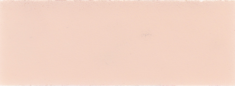
I start by mixing an opaque, neutral brown/beige colour. For this purpose I use SUPRA-white, opaque - burnt Sienna and brown Brazil.
1st basic shade, opaque
SUPRA-white, opaque + burnt Sienna + brown Brazil:
Mixing ratio 6:2:1
(6 drops SUPRA-white, opaque + 2 drops burnt Sienna + 1 drop brown Brazil)
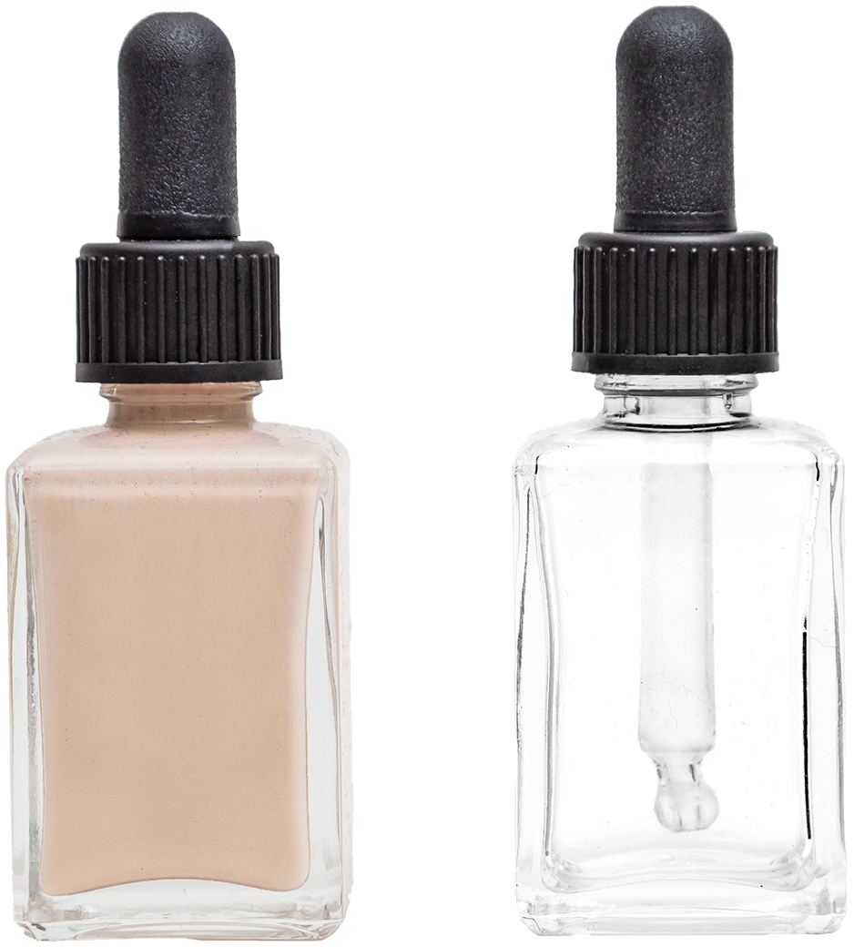
Premixing in an empty bottle
This colour tone forms the basis for mixing other colour tones/shades. I always mix this "basic shade opaque" directly in a bottle of Schmincke AERO COLOR. With a quantity of 600 drops of SUPRA-white, opaque, 200 drops of burnt Sienna and 100 drops of brown Brazil, this provides about a whole 28 ml bottle. It also makes sense to mix a larger quantity in order to always have the same colour shade available afterwards.
Opaque colours
The premixed basic shade, opaque, forms the base and can now be mixed further to create the following opaque colours/shades.
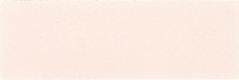
Base colour, opaque + SUPRA-white, opaque
Mixing ratio 3:5
Basic shade, opaque + burnt Sienna
Mixing ratio 10:1
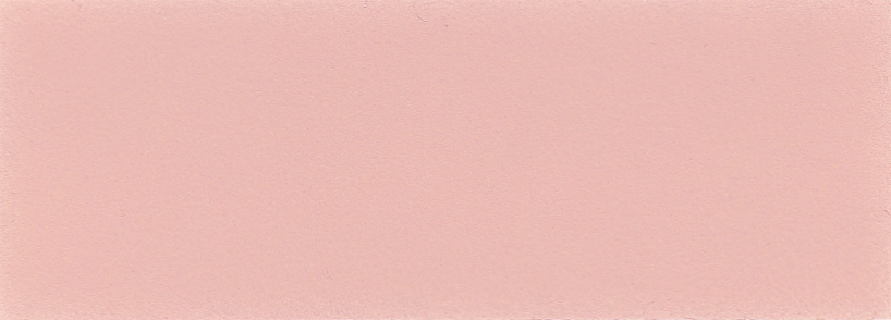
Basic shade, opaque + burnt Sienna + primary magenta
Mixing ratio 10:1:1
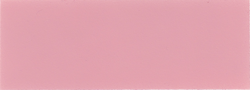
Basic shade, opaque + burnt Sienna + violet
Mixing ratio 20:1:1
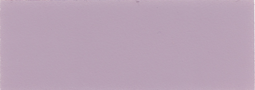
Transparent colours
The mixing ratio for transparent colour shades is listed below as follows:
Burnt sienna + brown Brazil
Mixing ratio 2:1
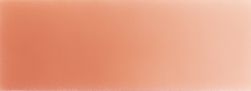
burnt Sienna + brown Brazil
Mixing ratio 1:2
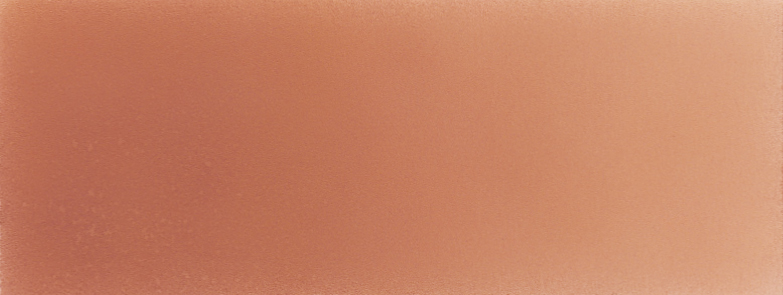
burnt Sienna + brown Brazil + primary Magenta
Mixing ratio 2:1:2
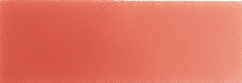
brown Brazil + primary magenta
Mixing ratio 1:3
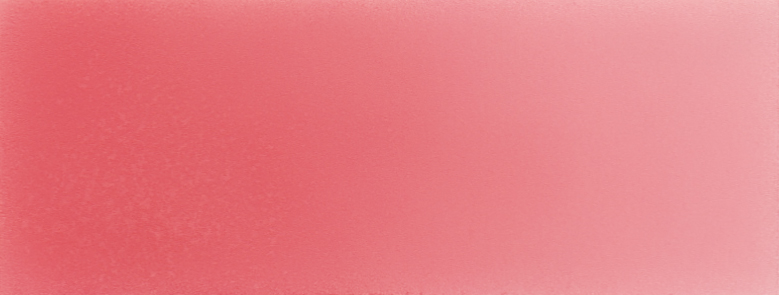
burnt Sienna + brown Brazil + violet
Mixing ratio 2:1:1
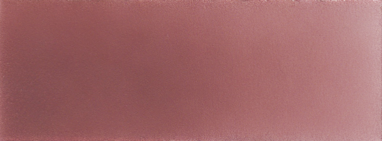
burnt Sienna + brown Brazil brown + violet + primary magenta
Mixing ratio 2:1:2:2
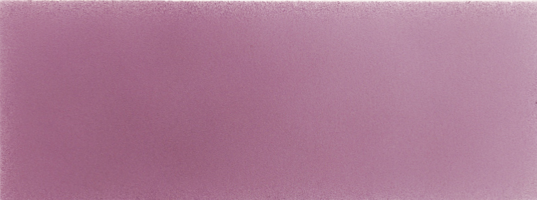
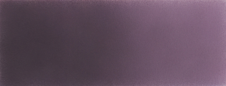
burnt Sienna + brown Brazil + Violet + Neutral Grey
Mixing ratio 1:2:1:1
Opaque base layer
I use the base colour, opaque, which I have already mixed, to underline the portrait evenly. I leave out the lips and eyes.
If the preliminary drawing is strong enough, it remains sufficiently visible despite the opaque colours.
In a portrait, the skin tones vary in slight colour shades in the individual parts of the face. The brightness of the colour tone also varies, depending on the lighting situation of the portrait. I define these gradations in the following steps in the base layer with opaque colours.
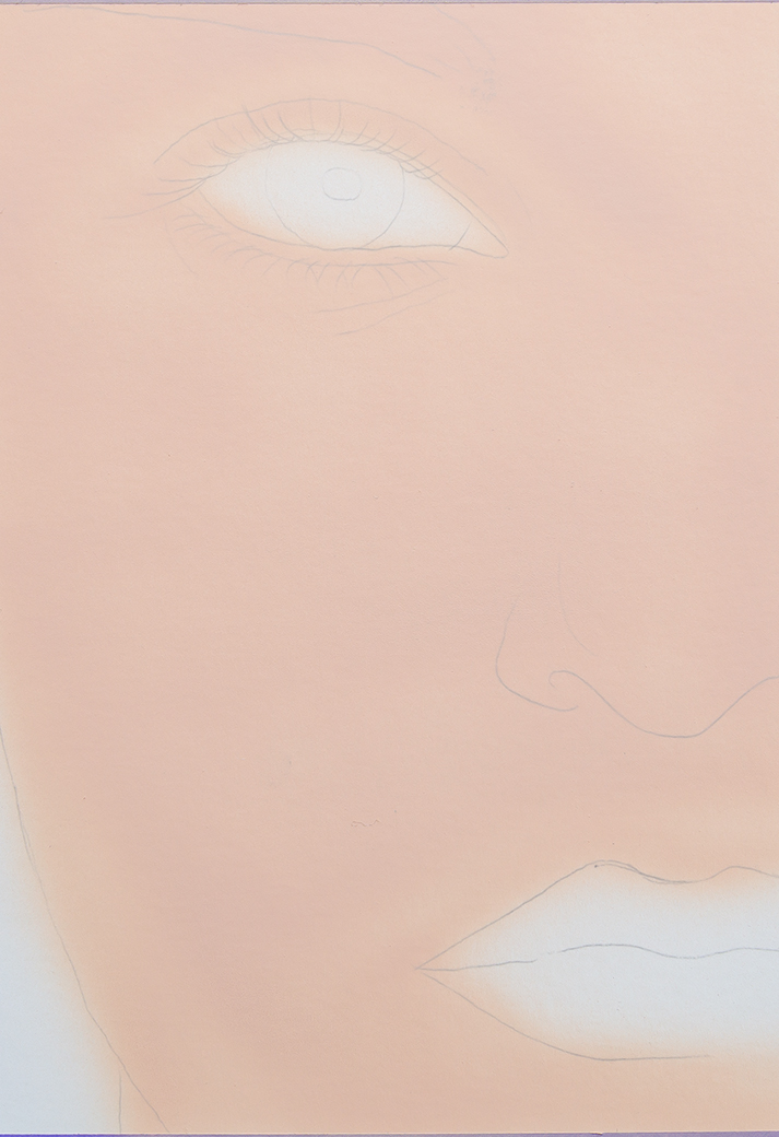

In the next step, I mix the base shade, opaque and SUPRA white, opaque (mixing ratio 3:5) to a lighter shade directly in the spray gun and apply the lighter areas of the face. These are the bridge of the nose, becoming lighter up to the tip of the nose, the brow bone, the cheekbones and the chin.
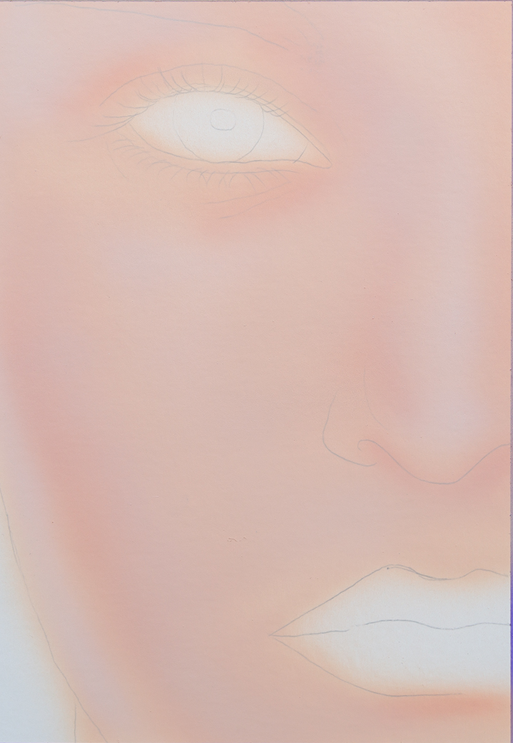

I use a mixture of base shade, opaque and burnt Sienna (mixing ratio 10:1) to create the darker areas of the face: the area around the eyes, the cheeks towards the back, the chin crease, the sides of the nose and the wings of the nose. This creates an initial plasticity and defines the front and back of the portrait.


I use the base tone, opaque, burnt Sienna and primary magenta (mixing ratio 10:1:1) to create the slightly more reddish areas of the face, e.g. around the nose and nostrils as well as the cheeks. This depends on the individual portrait. In addition, an underpainting of the lips can be created directly with the basic red tone. In this case, I also work out an even area first.
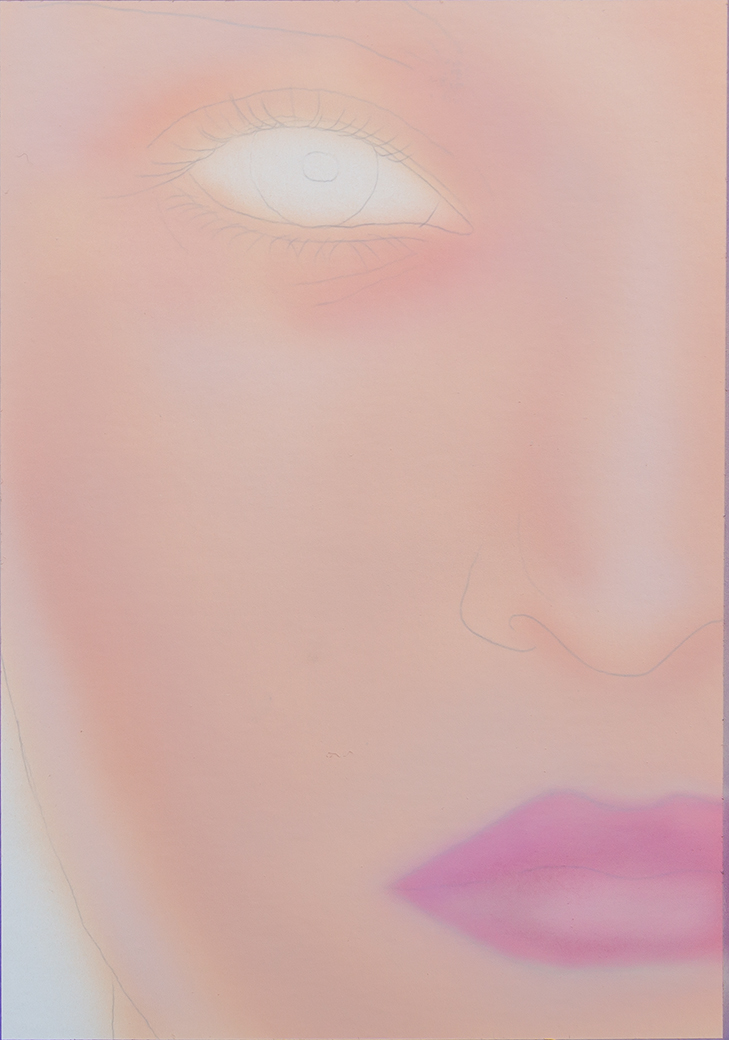

I paint the area around the eyes with the base colour, opaque, burnt Sienna and violet (mixing ratio 20:1:1). As the skin is thinner in this area, blood vessels shimmer through and the result is a violet/blue tone. But be careful! Otherwise it can quickly look pretty unhealthy.
This colour can also be used to shape the lips, i.e. to darken the corners of the mouth and the upper lip. On the lower lip, I lighten up the area in the spotlight with SUPRA white, opaque.

Advantages
By underpainting with opaque colours and reworking transparently, you'll have the advantage of erasing the skin structures. The opaque underpainting in the erased structures is preserving a natural and harmonious colour tone, as the white of the painting ground is not erased.
When working on canvas, where erasing is not possible, skin structures can simply be sprayed lighter with the mixed base colour, opaque or base colour before being reworked transparently.
If the painting becomes too dark, it can simply be lightened again with an opaque colour. Or if a mistake is made, it can be corrected and reworked with an opaque colour.
Disadvantages
You have to get used to using opaque colours or white, as these run through the spray gun a little slower. In addition, the annoying cleaning of the spray gun when changing from opaque to transparent colours requires a little more attention.
As I work exclusively on canvas and constantly alternate between opaque and transparent colours, I got used to use two spray guns.
Transparent colour application
The colour mixture of burnt Sienna and brown Brazil brown (mixing ratio 1:2) produces a yellowish brown tone, which I use to create the first skin structures and gradients in the portrait. To spray the skin structure, I dilute the colour sufficiently so that it does not become too dark. Further skin structures can then be erased in these transparent colour layers.
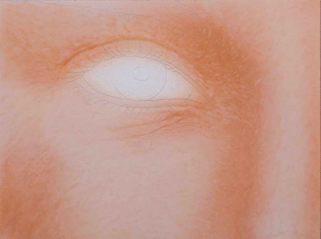

With a further colour mixture of burnt Sienna and brown Brazil (mixing ratio 2:1), I create a more reddish brown tone, with which further colour nuances can be applied to the face. I use this technique to spray gradients and to create further skin structures.
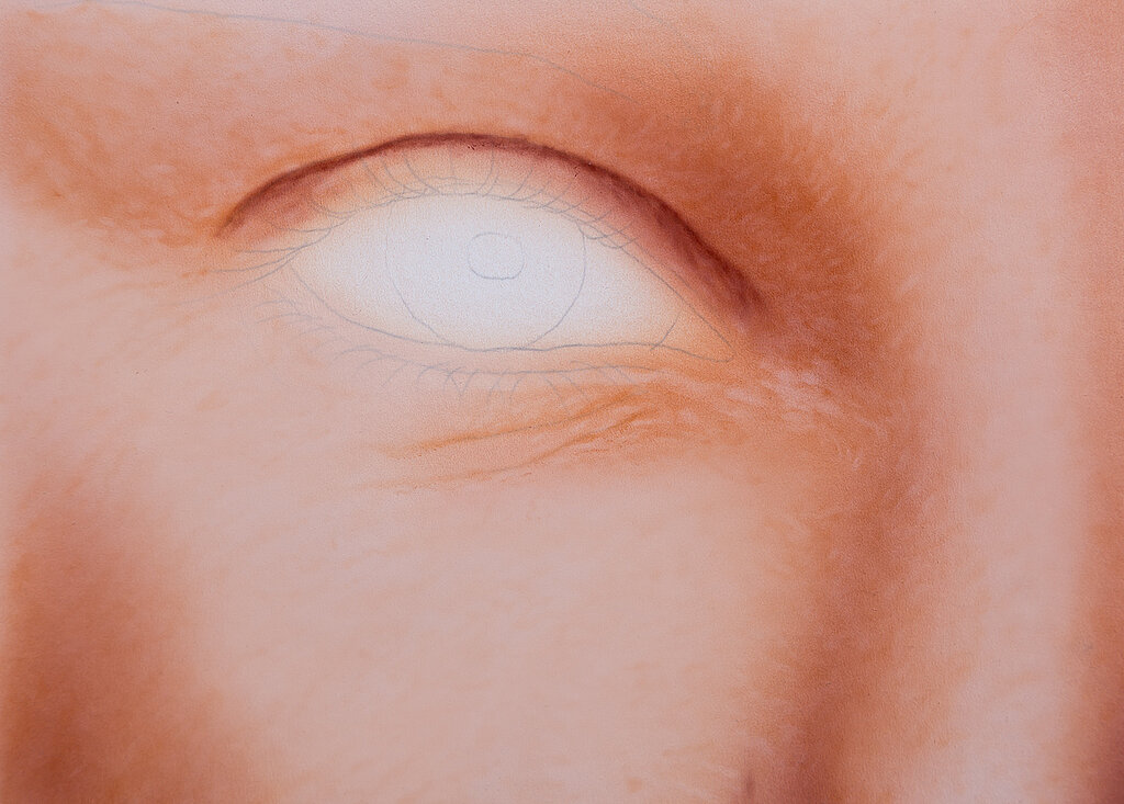

If I add burnt Sienna, brown Brazil and violet (mixing ratio 2:1:1) to the mixture, the colour can be further darkened to create a shadow tone, which I use to define for e.g. the crease of the eyelid or the crease of the nostril. It can also be used to define the lips, shadows in the corners of the mouth and the structure of the lips. The upper lip can be darkened more with this shade as well as it is slightly more in shade than the lower lip due to the angle.

You can mix a further shadow tone from burnt Sienna, brown Brazil, violet and neutral grey (mixing ratio 1:2:1:1). This can be used to create deeper features of the portrait, as well as cast shadows on the nose or nostrils. This colour mixture produces a dark, violet-grey tone.
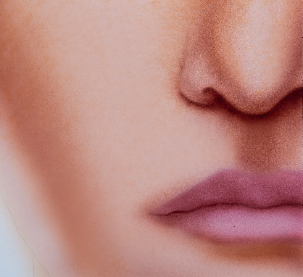

To bring the portrait to life and achieve a natural look, I add further colour nuances.
Burnt Sienna, brown Brazil and primary magenta (mixing ratio 2:1:2) create a reddish-orange brown tone. I use this to rework the portrait in some areas.
By mixing brown Brazil with primary Magenta (mixing ratio 1:3), you'll get another red tone, which can be used around the nose and cheeks.
Burnt Sienna, brown Brazil, violet and primary magenta (mixing ratio 2:1:2:2) result in a broken red-violet tone. This is usually found around the eyes or eyelids.
The lips can also be worked out layer by layer with these colour tones. The same goes for the tear duct, the edge of the eyelid or small veins in the eye.
I carefully apply these colour shades in thin layers and gradually move the colour tone in the right direction on the painting surface.
The colour tones on the face vary from individually.
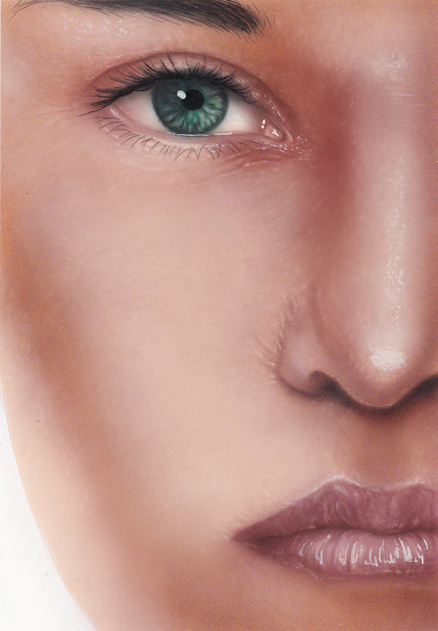


Highlights and shiny areas of the skin are essential. This is what adds vibrancy to a portrait. I make these highlights lighter in the painting with the base colour. If necessary, the colour tone is lightened a little further with SUPRA white, opaque.
Finally, you have the option of using the mixed base tone, opaque, which can be diluted with a little water for this purpose, to carefully and very thinly rework the portrait in some areas. This allows skin structures to be softened and light areas of the face to be emphasised. If necessary, this can also be used to shift the skin tone back to a more pastel shade.
TIP: All mixing ratios for this report have been counted exactly, but only serve as a suggestion. You are welcome to work "freely" and it is always worth experimenting with your own mixing ratios, especially as every skin type is unique.
The artist
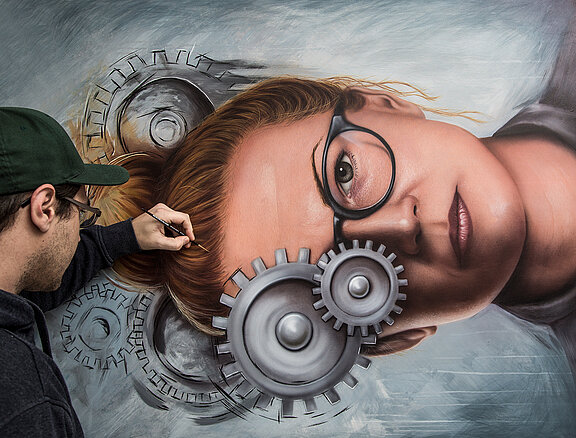
Sebastian Kaufhold
Born 25/12/1987 in Siegen, Germany.
Lives and works in Bochum, Germany.
- 2010-2013 Art studies at the IBKK Art Centre
- 2013-2014 Masterclass with Roland Kuck
- 2014 Graduation: diploma as airbrush designer
- 2015-2017 Studies illustration/ DTP computer graphics
- 2017 Graduation: diploma as DTP specialist
- 2018 Graduation: diploma as illustrator
Instagram: @kontrastformat

