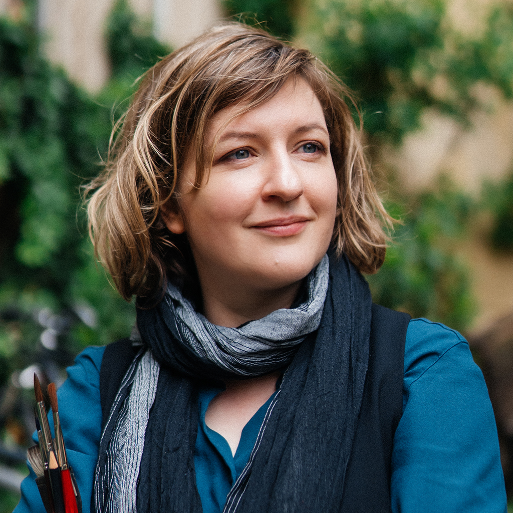
Marina Abramova is an artist whose work is shaped by a refined sense of atmosphere, colour, and the quiet beauty of everyday life. Using watercolour as her central medium, she creates pictorial worlds that feel both sensitive, vivid, and expressive. Her artistic language brings together observation, emotion, and openness, drawing attention to subjects that may seem ordinary at first glance, yet reveal a distinctive depth when viewed more closely. Alongside her independent artistic practice, she is also active in exhibitions and in sharing artistic knowledge through teaching.
Deine Begeisterung für Schmincke - 9 Fragen an Marina
What’s your name, where are you from?
My name is Marina Abramova and I was born in Kolomna in Russia. Since 2009 I have been living in Germany and the last seven years in Berlin.
Since when and in which techniques do you mainly work?
I am absolutely in love with watercolor. I have been working with this material since 2012.
Do you have favourite themes? What inspires you?
My favorite themes are cityscapes and landscapes. I paint semi-abstractly. For me it’s very important to tell a story through my painting and to show feelings. I always take inspiration from my life and I bring my experiences through watercolor onto paper.
And where do you paint preferably?
I like to paint outside in a sketchbook, and for larger works I take sketches and photos of the place as inspiration and then work in the studio.
Do you still remember your first Schmincke colour?
If I had known that I would have to answer this question, I would have paid more attention 😊 Unfortunately I don’t remember my first colour, but I remember that I got a few tubes of Schmincke Horadam when I decided to switch from pans to tubes. That was an important decision for my artistic process – tube colors give me a lot of freedom.
What are your favourite colours?
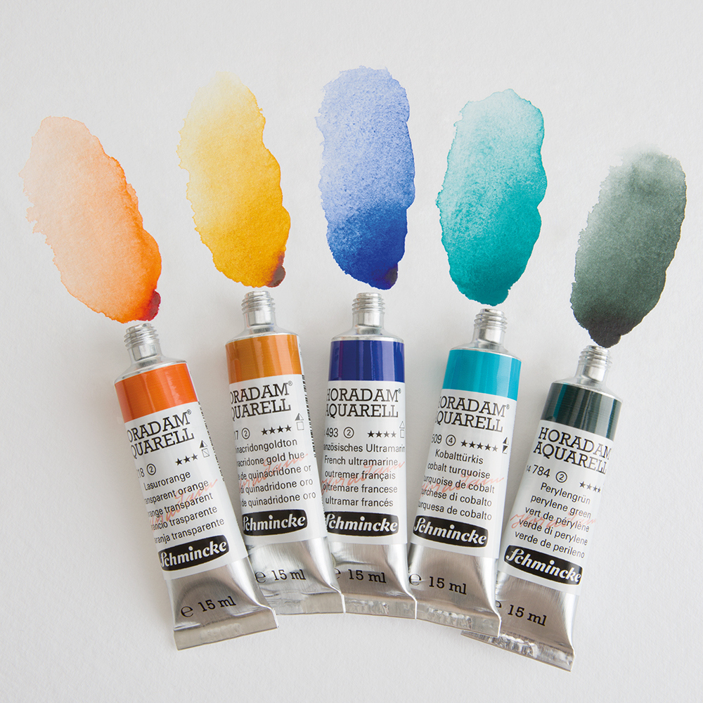
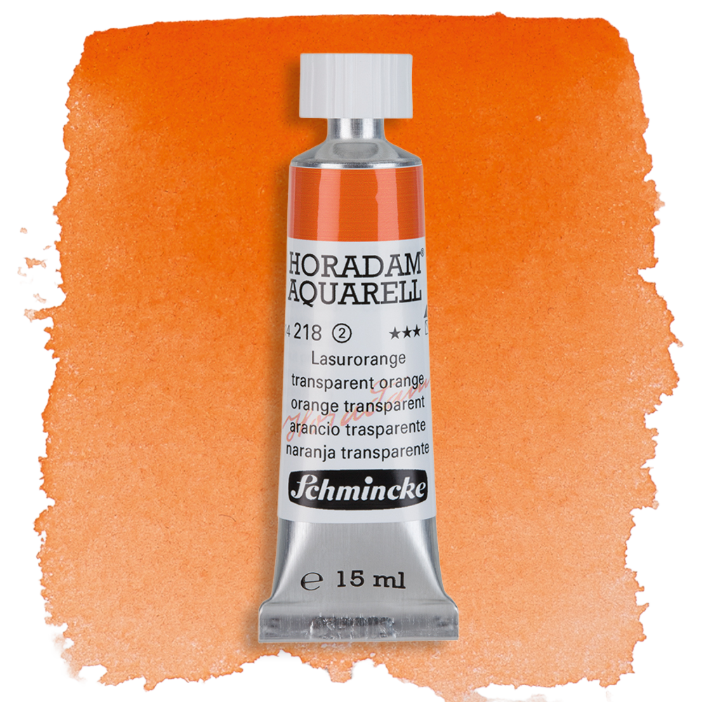
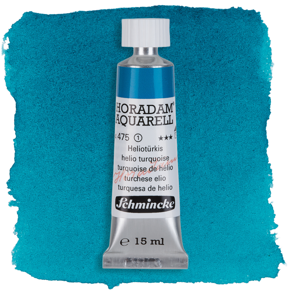
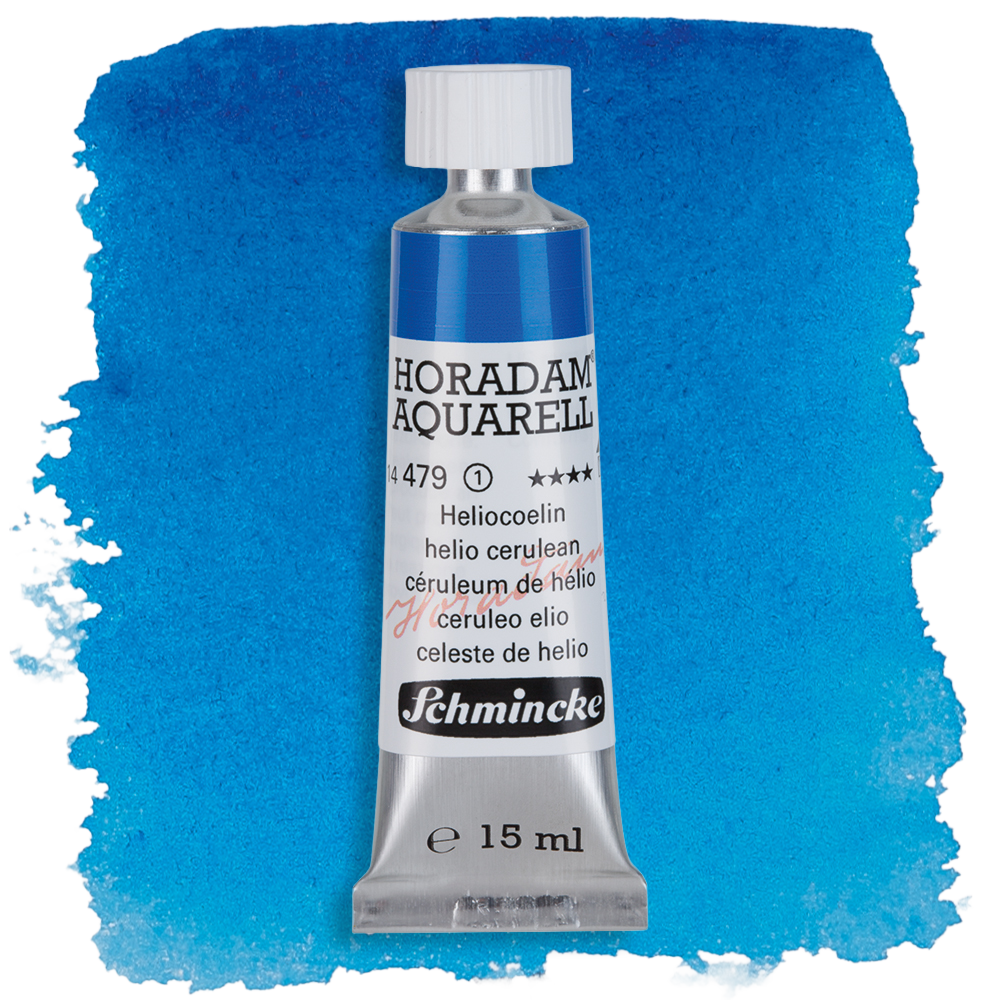
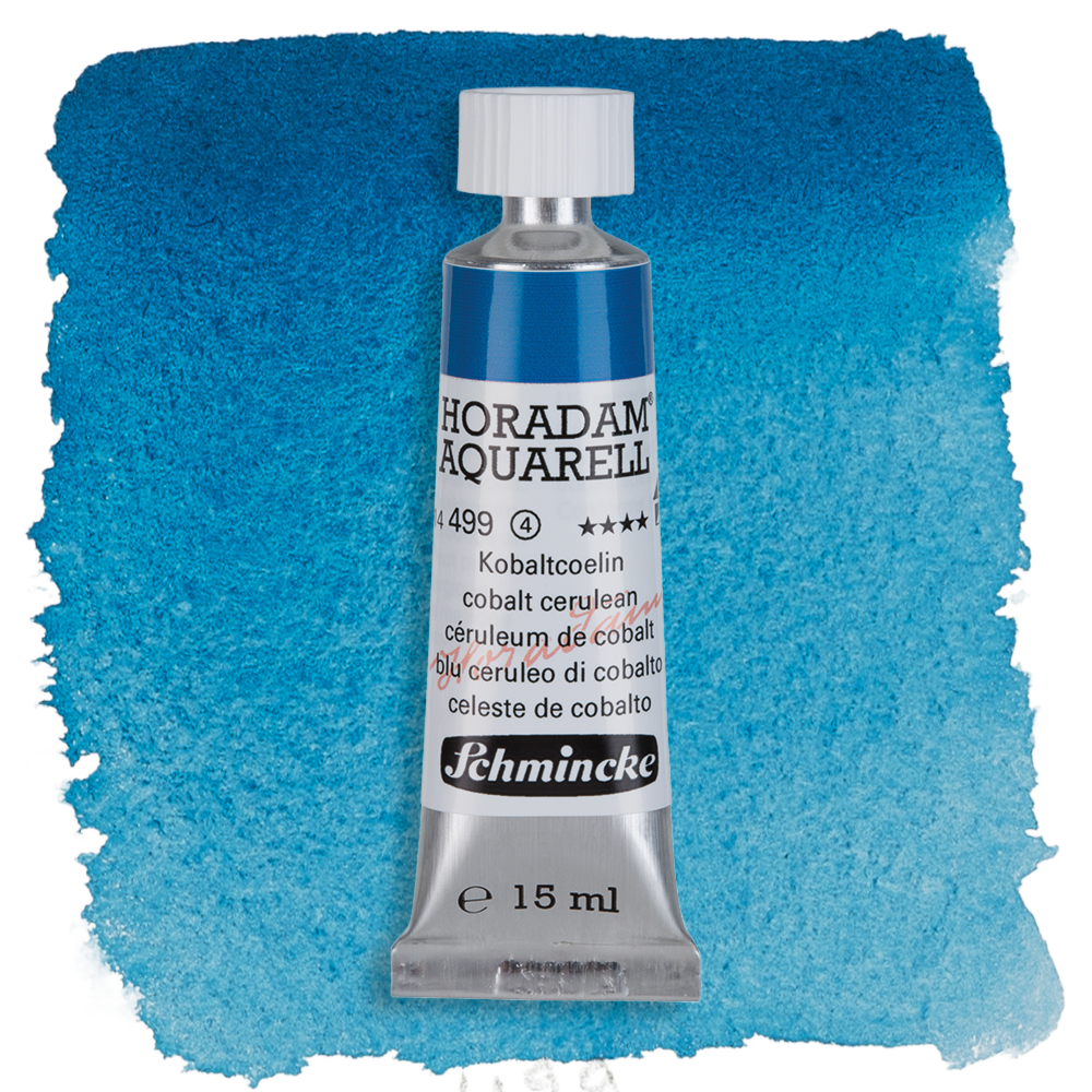
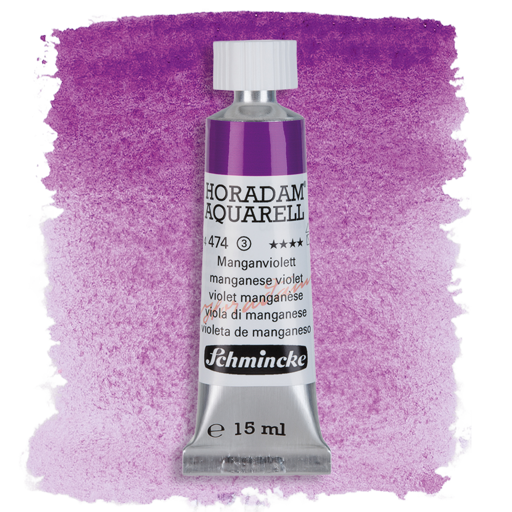
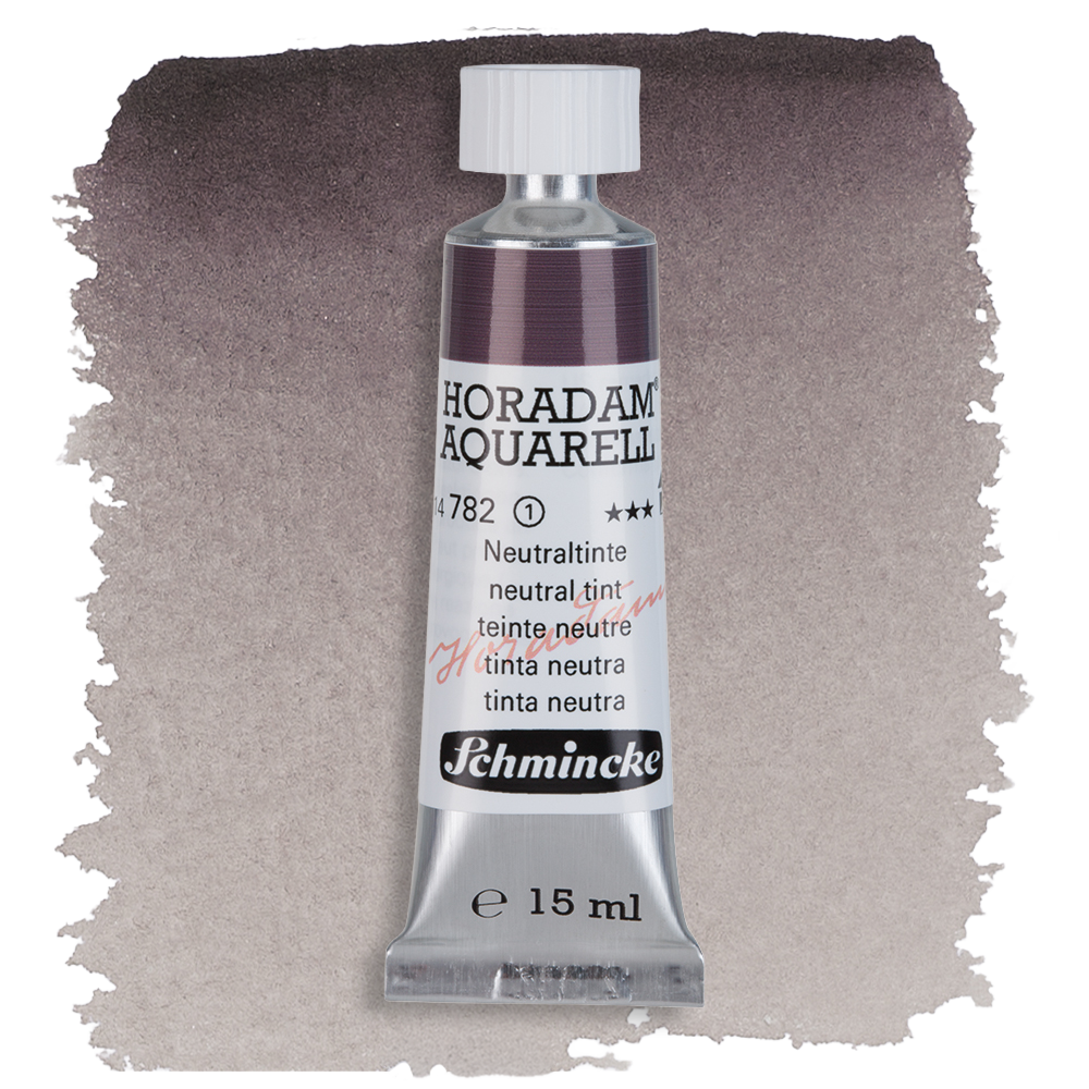
My favorite colors from Schmincke Horadam are transparent orange, phthalo green, helio turquoise, helio cerulean, cobalt cerulean (as you can see, I like blue colors 😊), manganese violet and neutral tint. Transparent orange is a beautiful, very intense color that I like to use as a contrast to blue tones. Phthalo green is perfect for mixing, manganese violet granulates beautifully, and neutral tint is great for night scenes.
How can we learn from you?
I give many workshops and courses in Germany(kurse bei boesner) and across Europe. News can always be found via my Instagram or website.
And where can we see your works?
My works are often shown at watercolor festivals and events - this year in Fabriano, in Córdoba, in Canada, and in England at the International Watercolor Masters (IWM), as well as for the first time in London at the annual exhibition of the Royal Institute of Painters in Water Colours (RI). And of course, my paintings can be seen online on Instagram and on my website.
Which two or three of your works should we show our readers?
The painting hanging in London is called “The Delay.” I believe anyone who has ever waited on a platform for a delayed train can easily imagine themselves in these people and their thoughts, and know the messages they are typing and reading.
“The City of Light” is a painting about Paris, as I experienced the city in December just before Christmas.
And the last painting is “What’s next?” It is a self-portrait that probably says a lot about me 😊